Tidal Trails
A brand identity for an exhibit concept, developed through spatial storytelling, typography, and a calm immersive system.


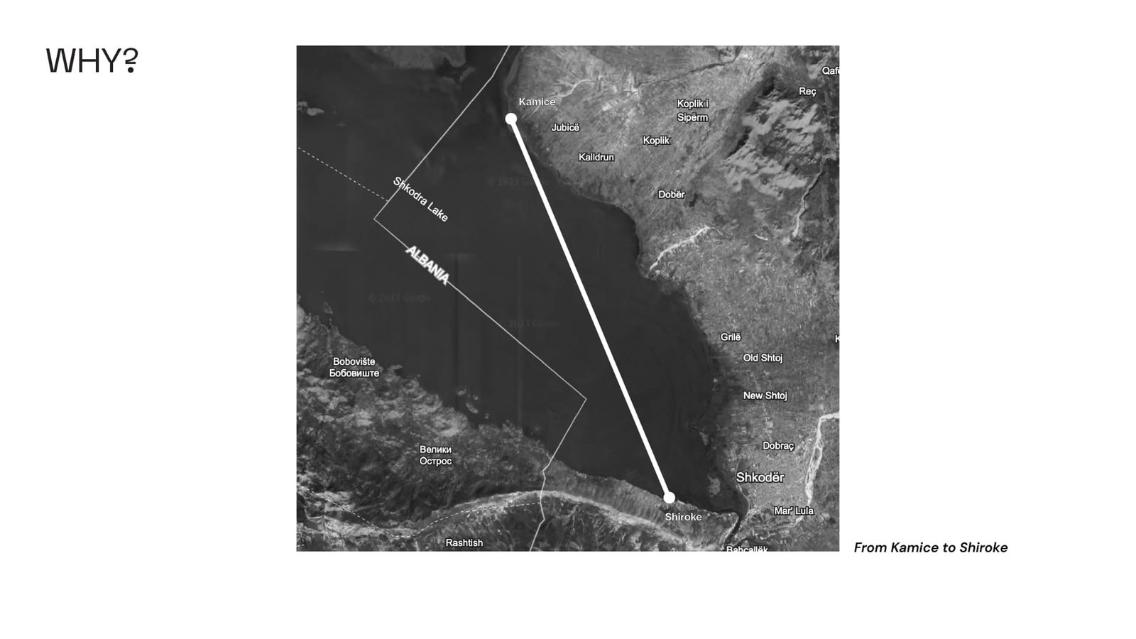
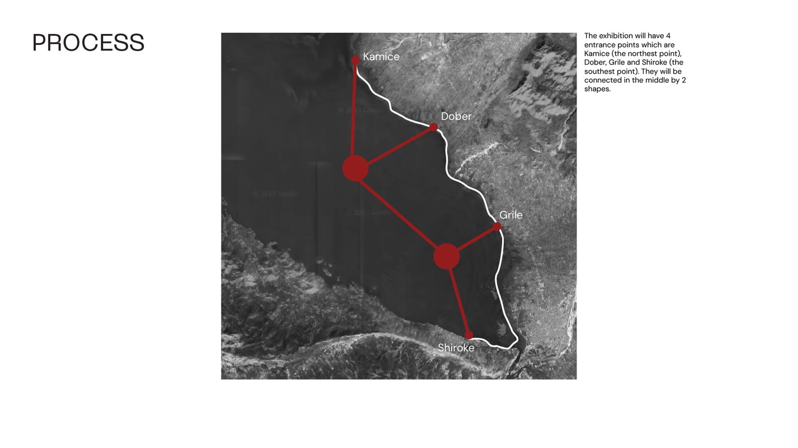
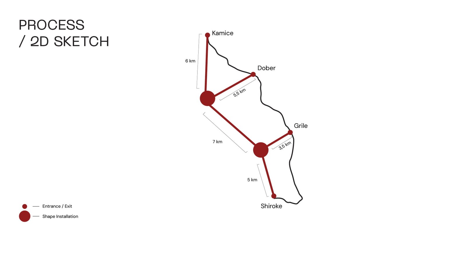
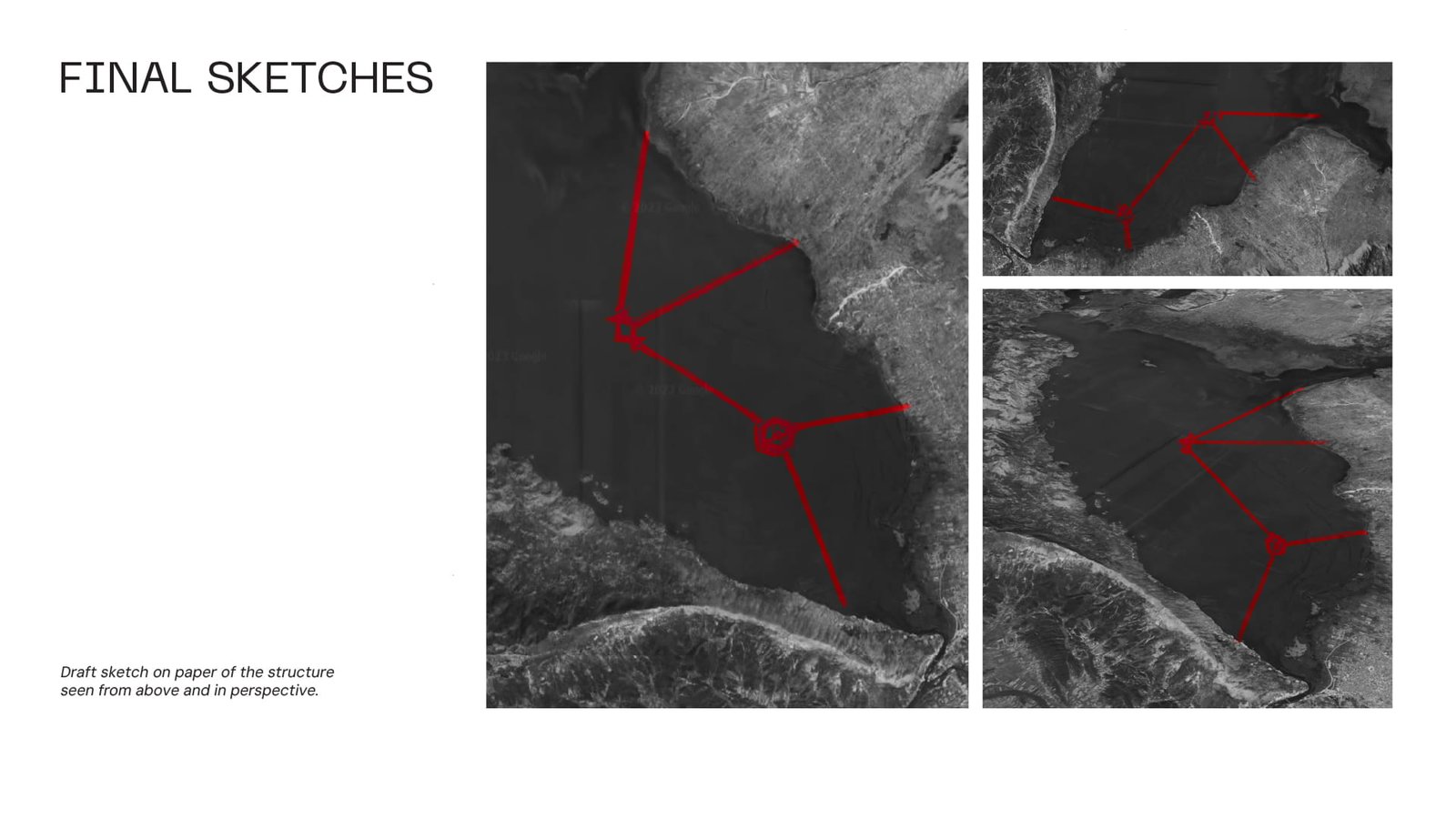
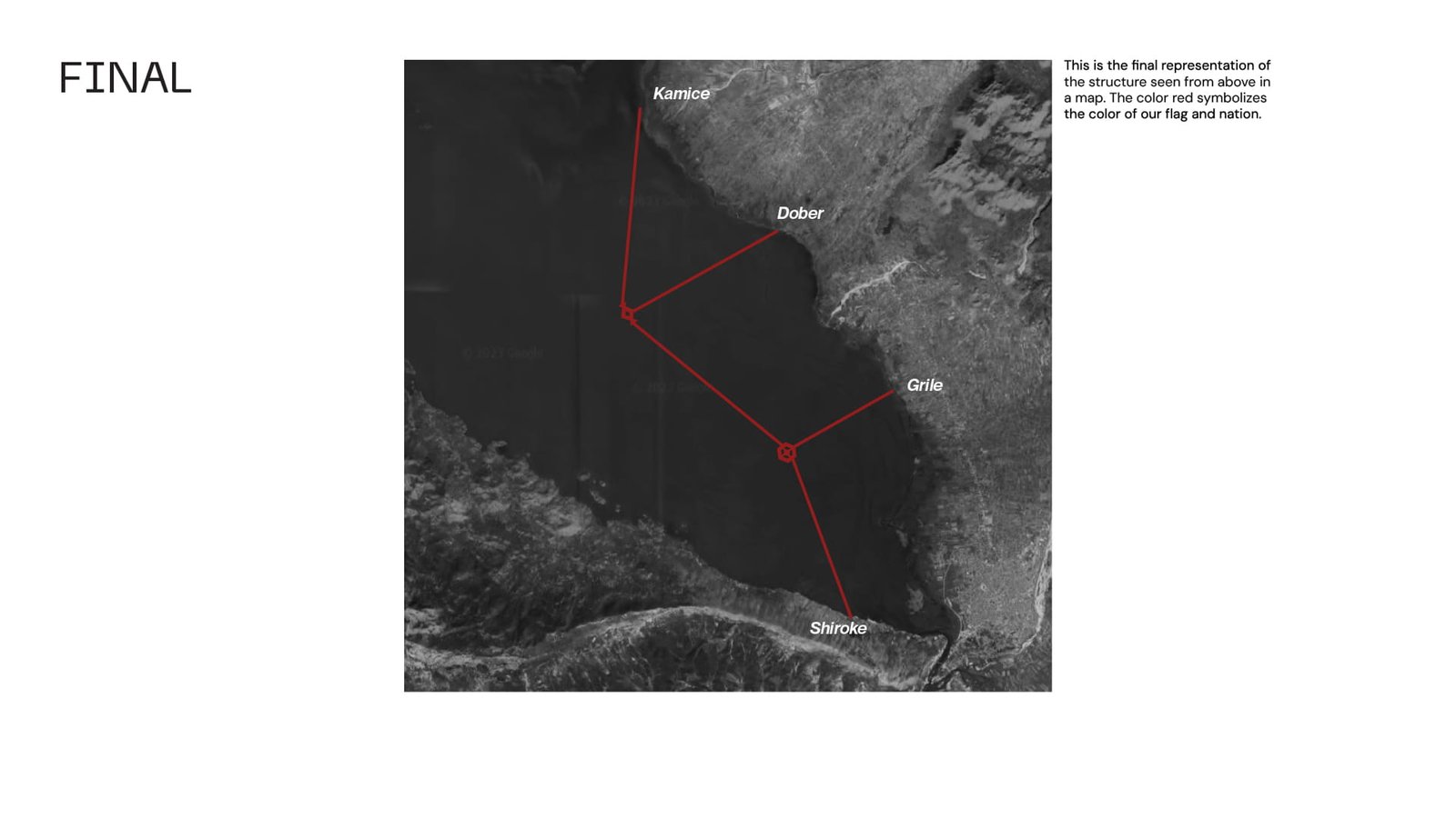
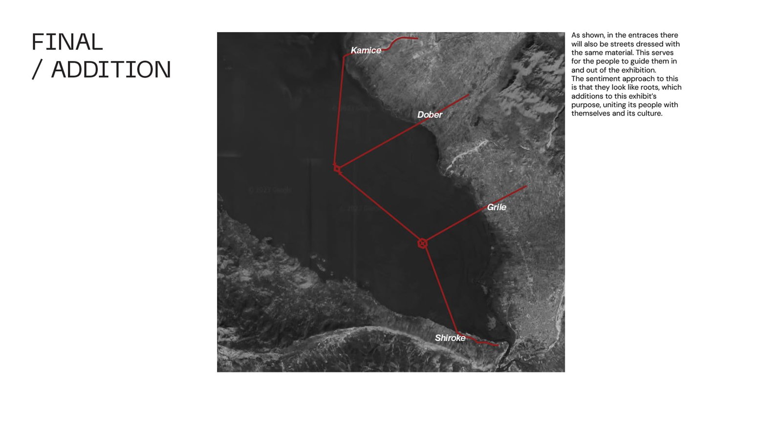
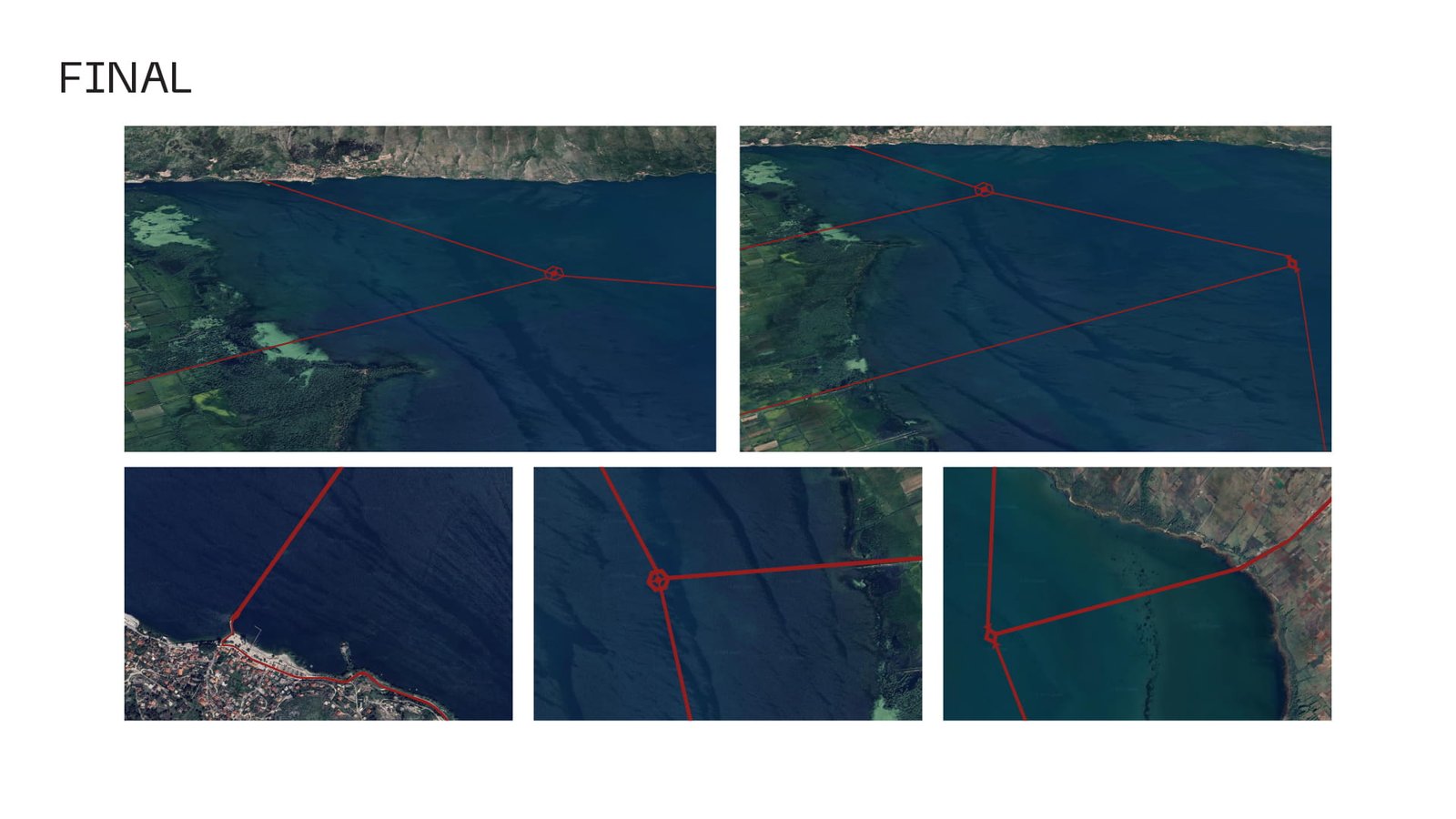
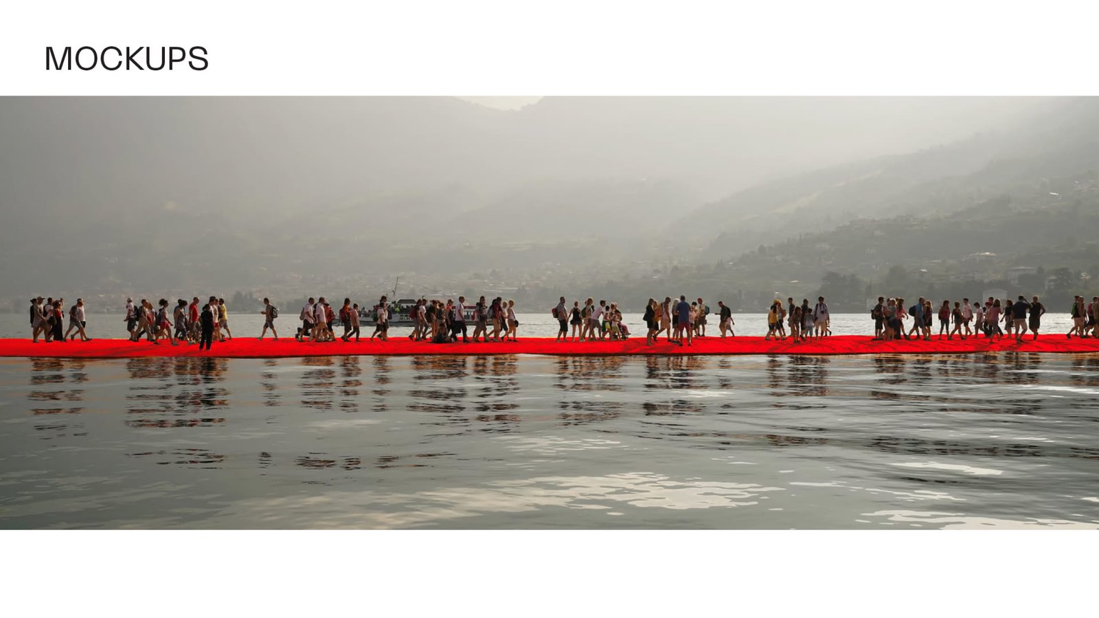
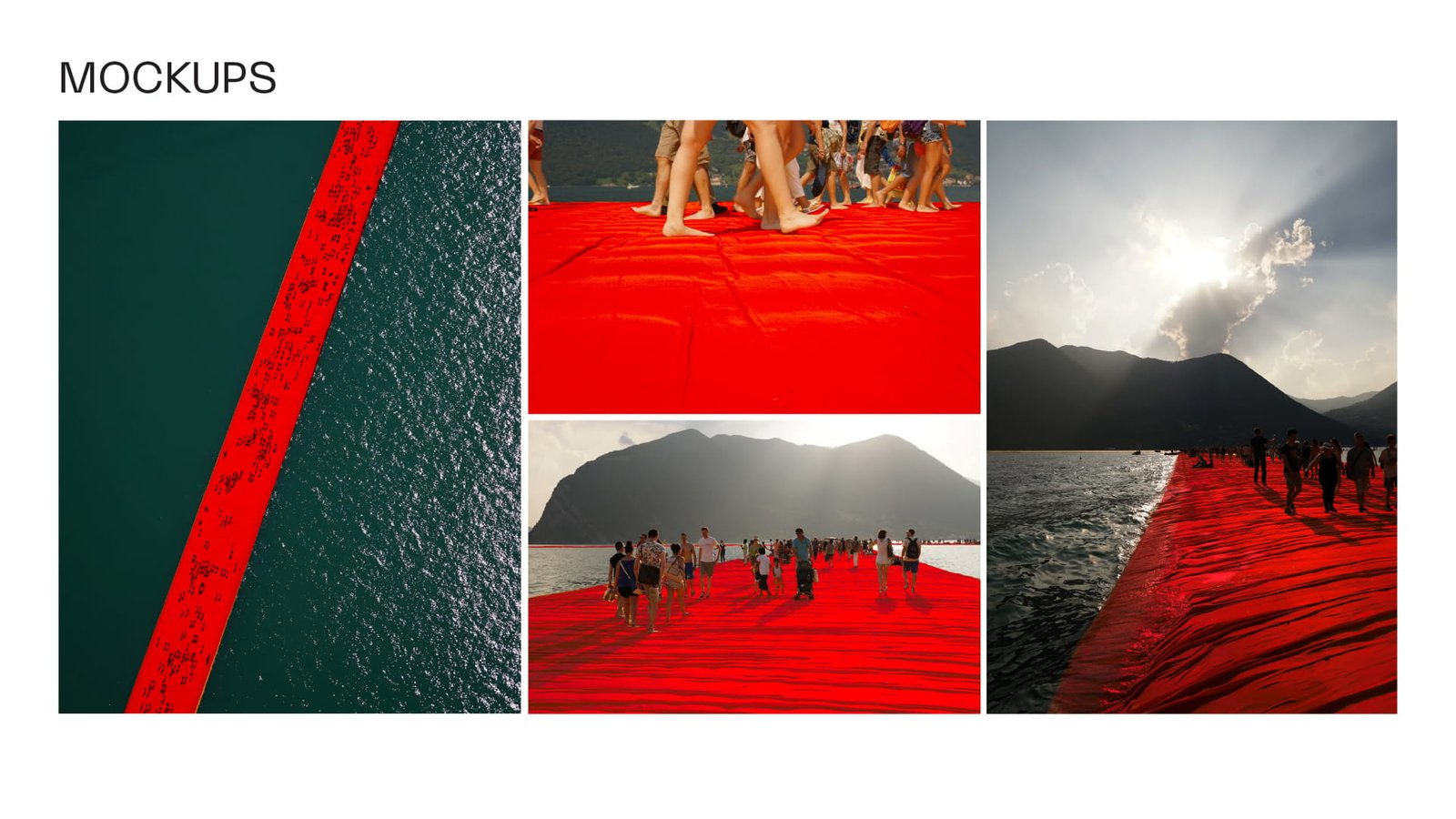
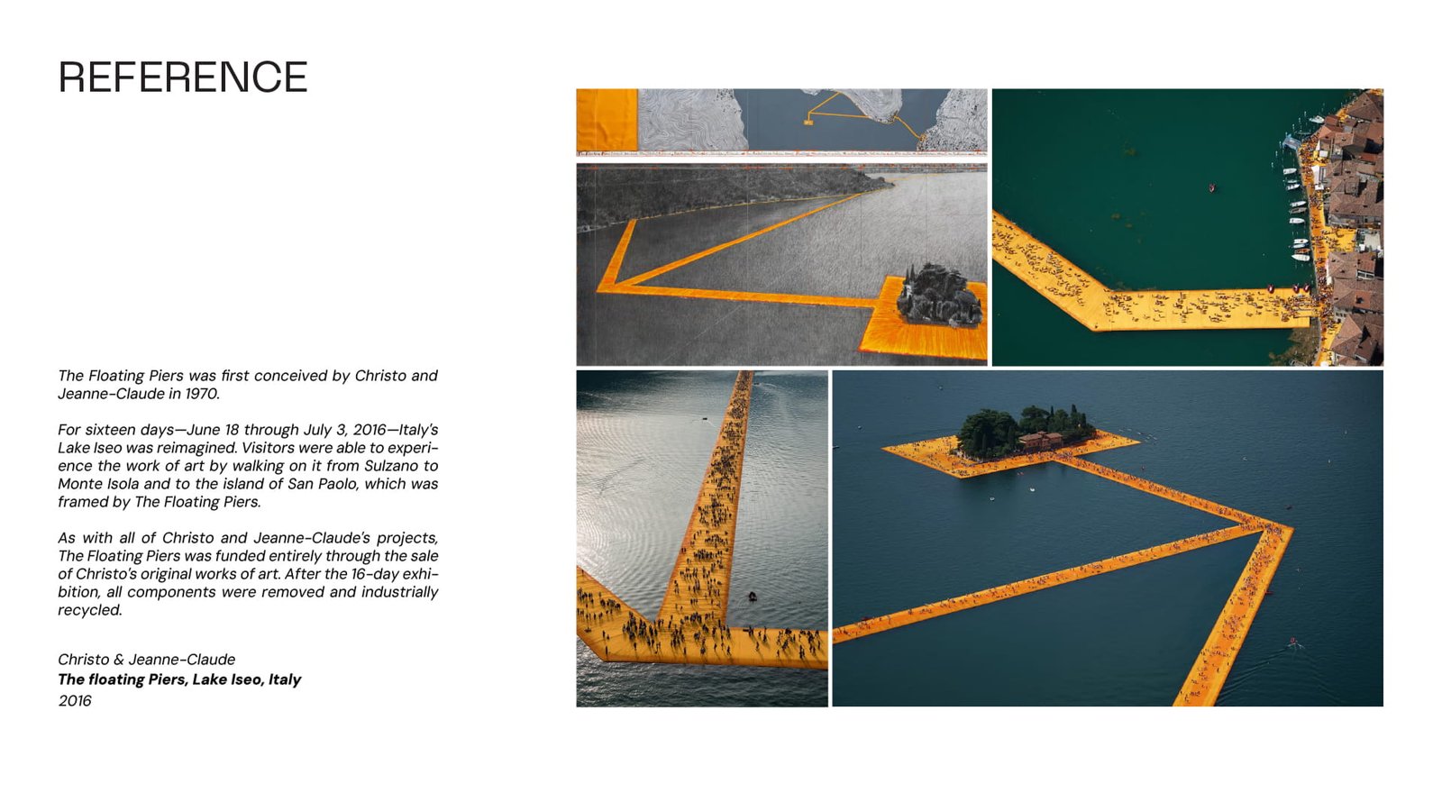
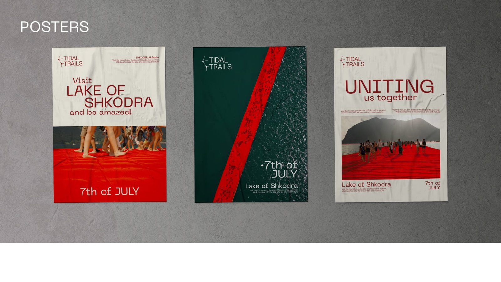
Connecting the northest and southest point of Shkodra serving as a symbolism of connecting the people together meanwhile educating them on the wildlife that surrounds our lake.
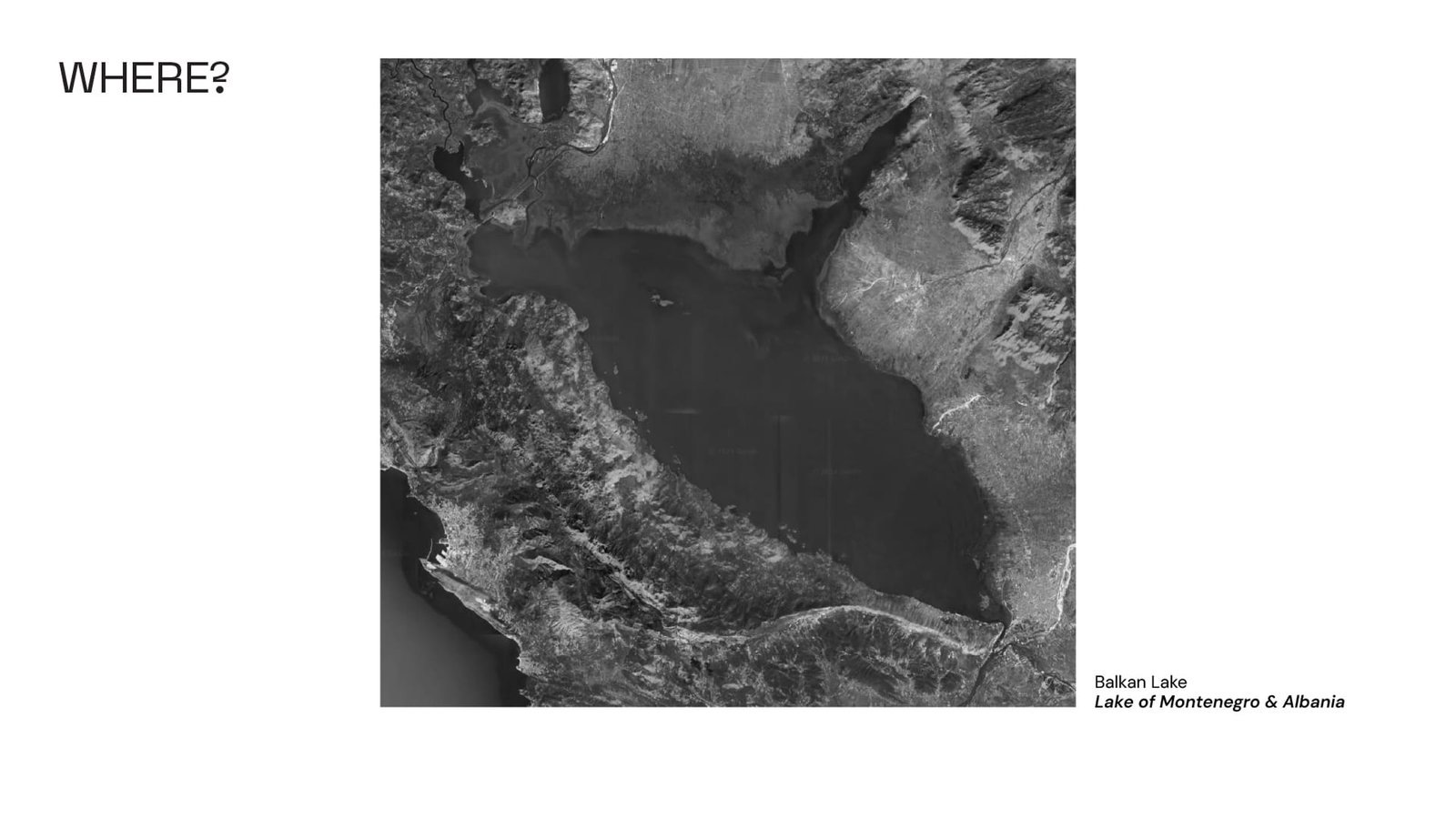 This project is focused on the Lake of Shkodra, which is part of the Albanian country.
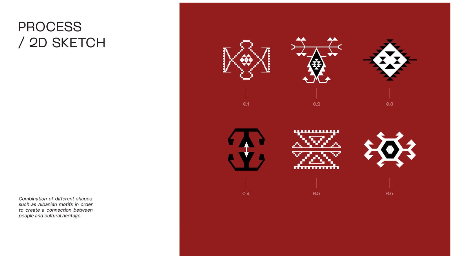
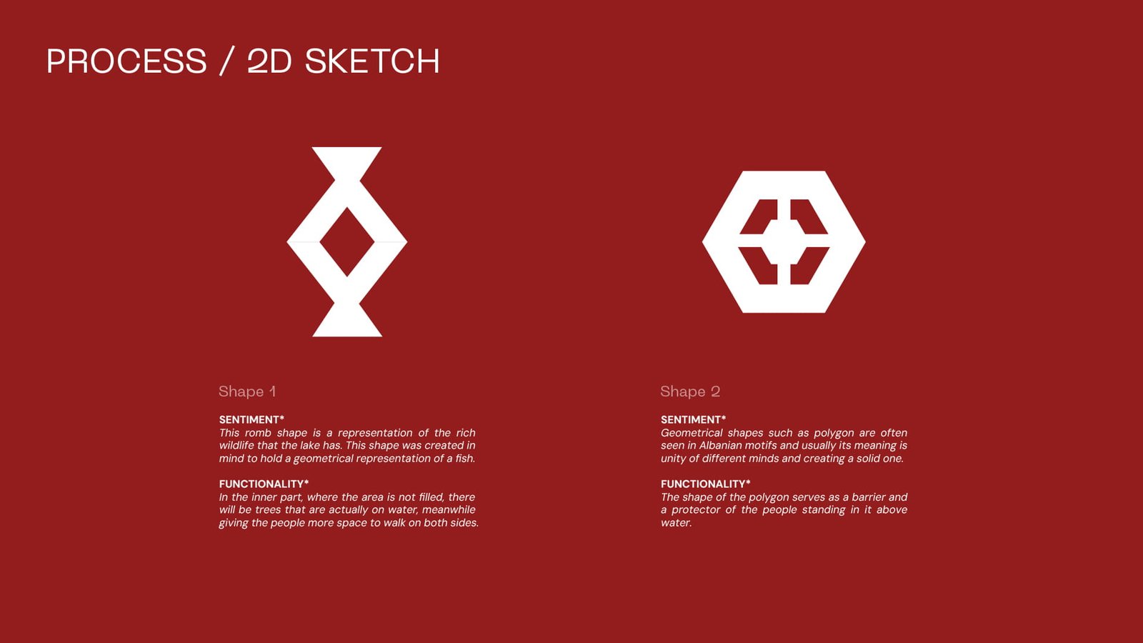
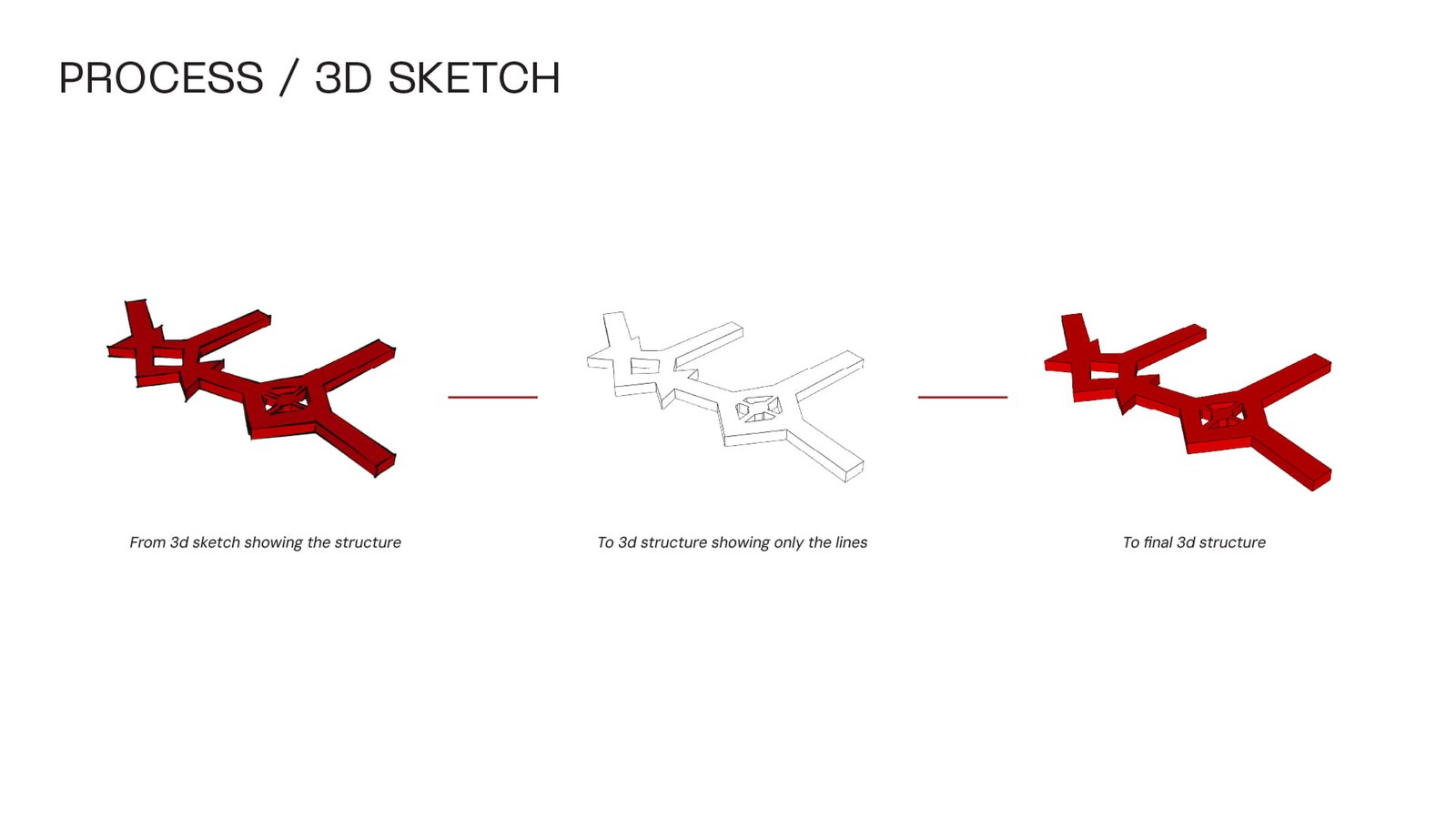
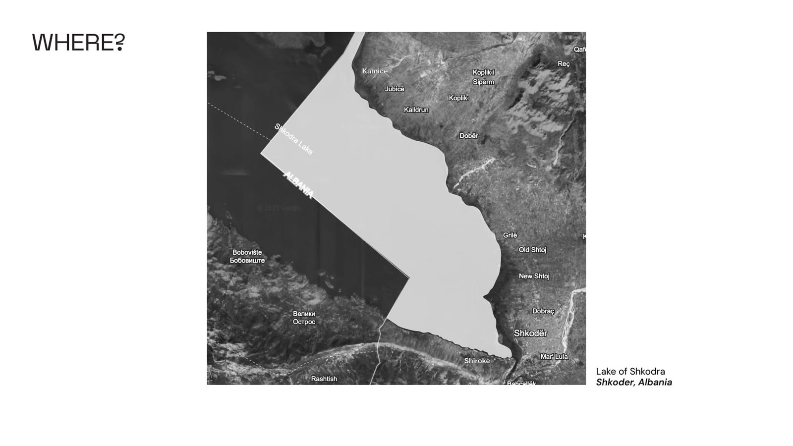 The exhibition seeks to connect the citizens with our city's nature through a trail along the lake which connects the northest and southest point, in order to create a shared space for community engagement, appreciation of the urban-natural interplay and also serves as an educative exhibit for the citizens to guard our wildlife.

About the Project
Client: Tidal Trails
The Brief. A focused brand and digital case study shaped around a clear creative direction, visual system, and presentation framework.
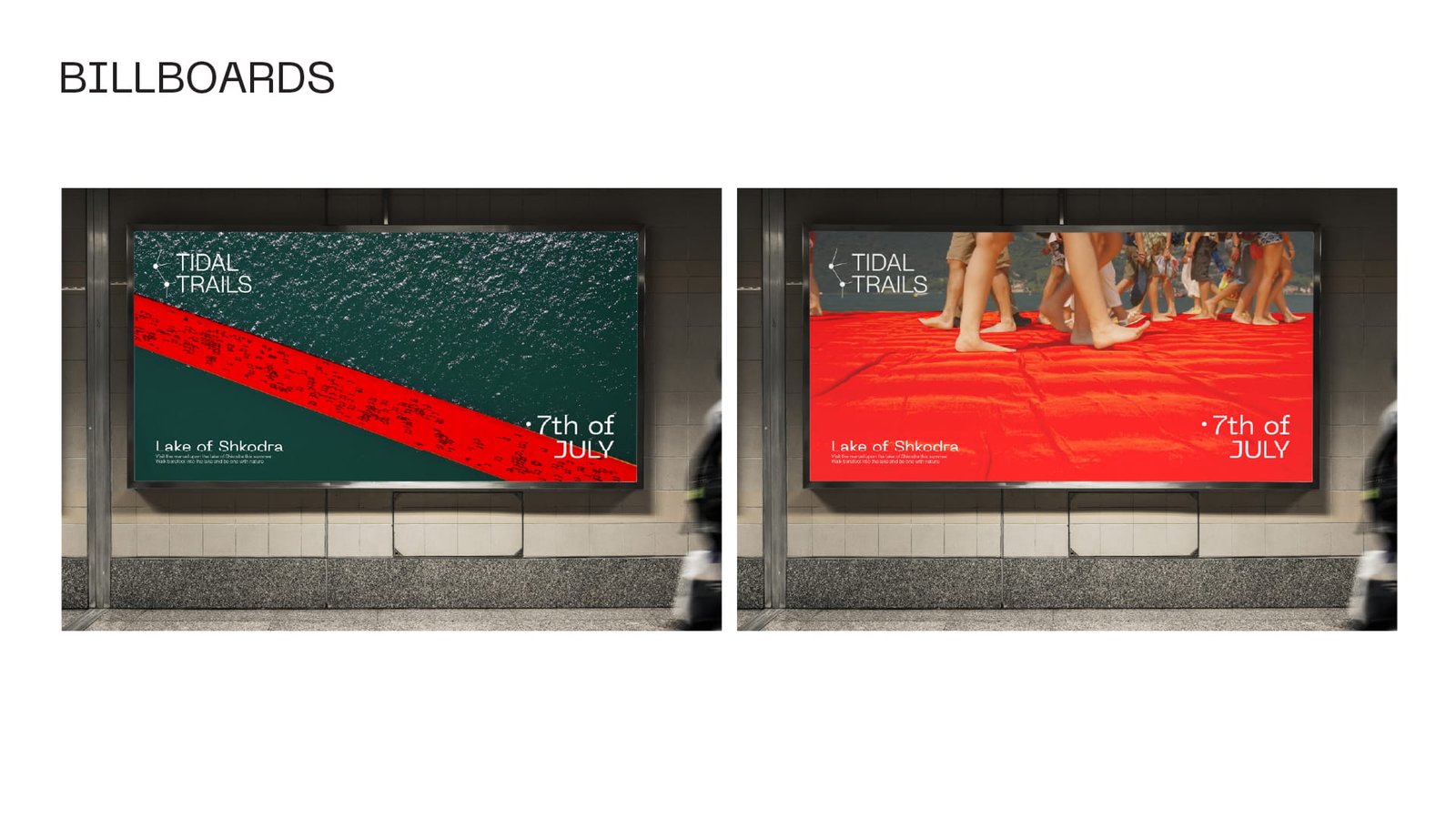
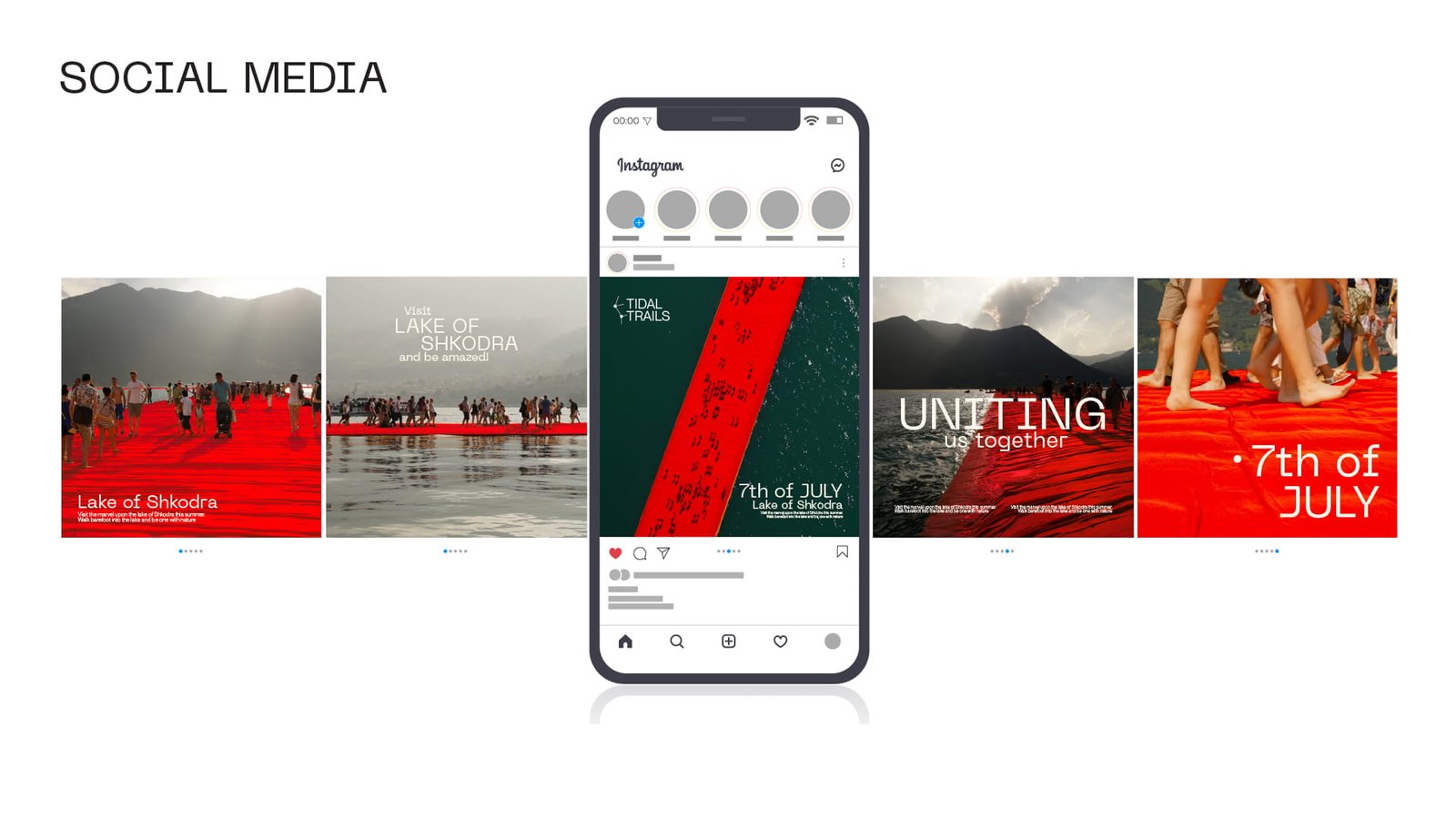
Our Approach. PHORM x MORPH developed a cohesive identity language across strategy, visual design, and digital touchpoints, keeping the system adaptable for future content updates.
The Outcome. A structured case study section is in place for the final project story, credits, and supporting details.
Credits
Studio:
PHORM x MORPH
Creative Direction:
Enrik, Founder, PHORM x MORPH
Design:
PHORM x MORPH studio team
Year:
2025