
Mini Bloom Kids
A playful visual identity built around growth, care and confident discovery.
About the Project
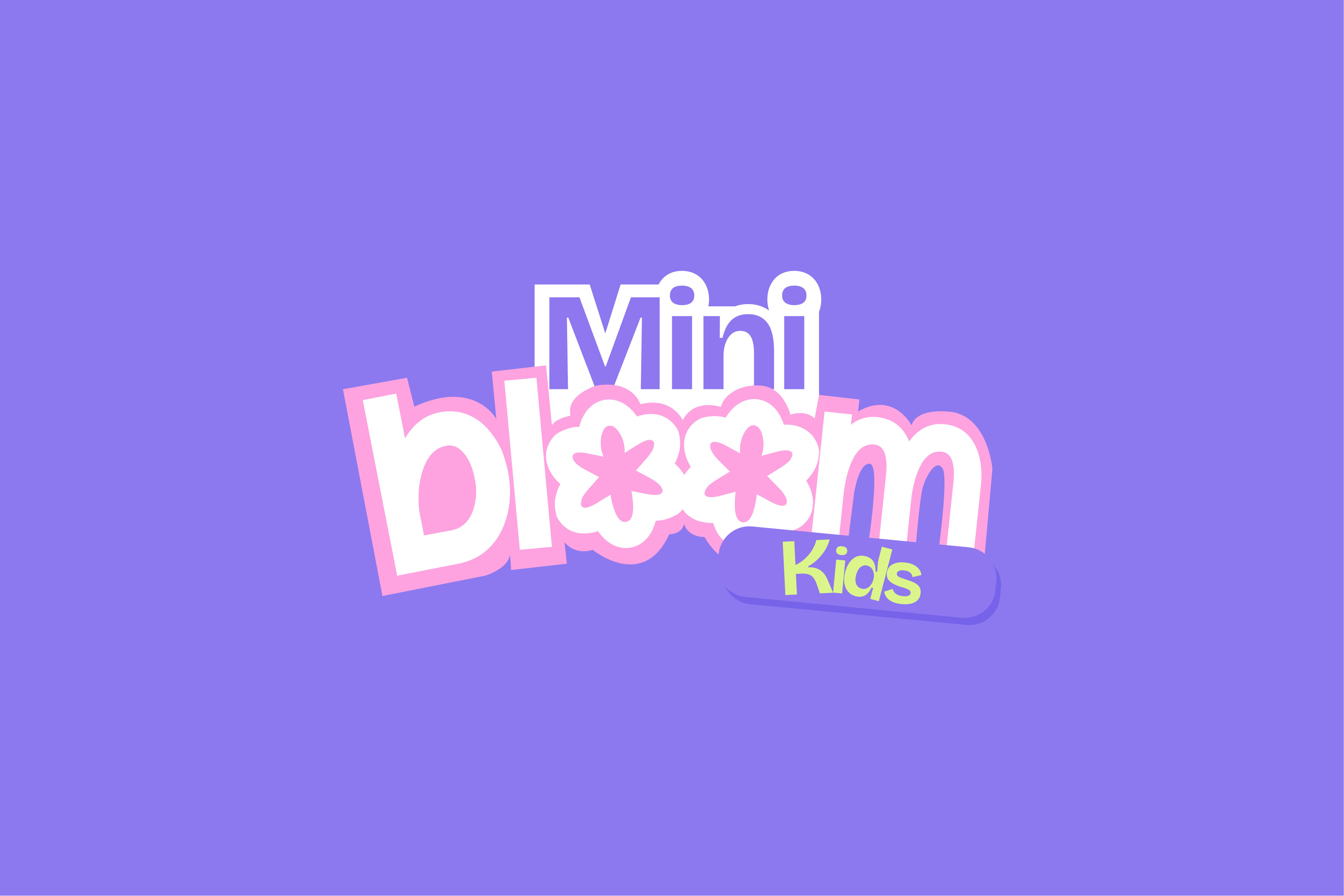
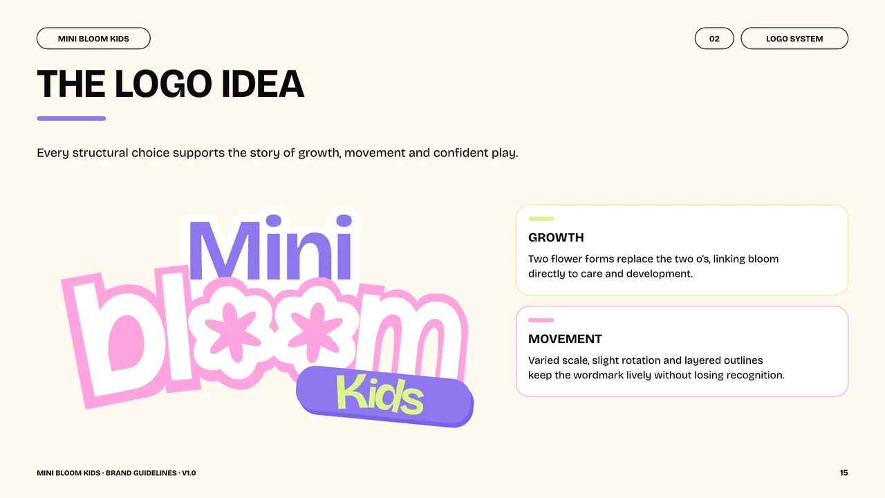
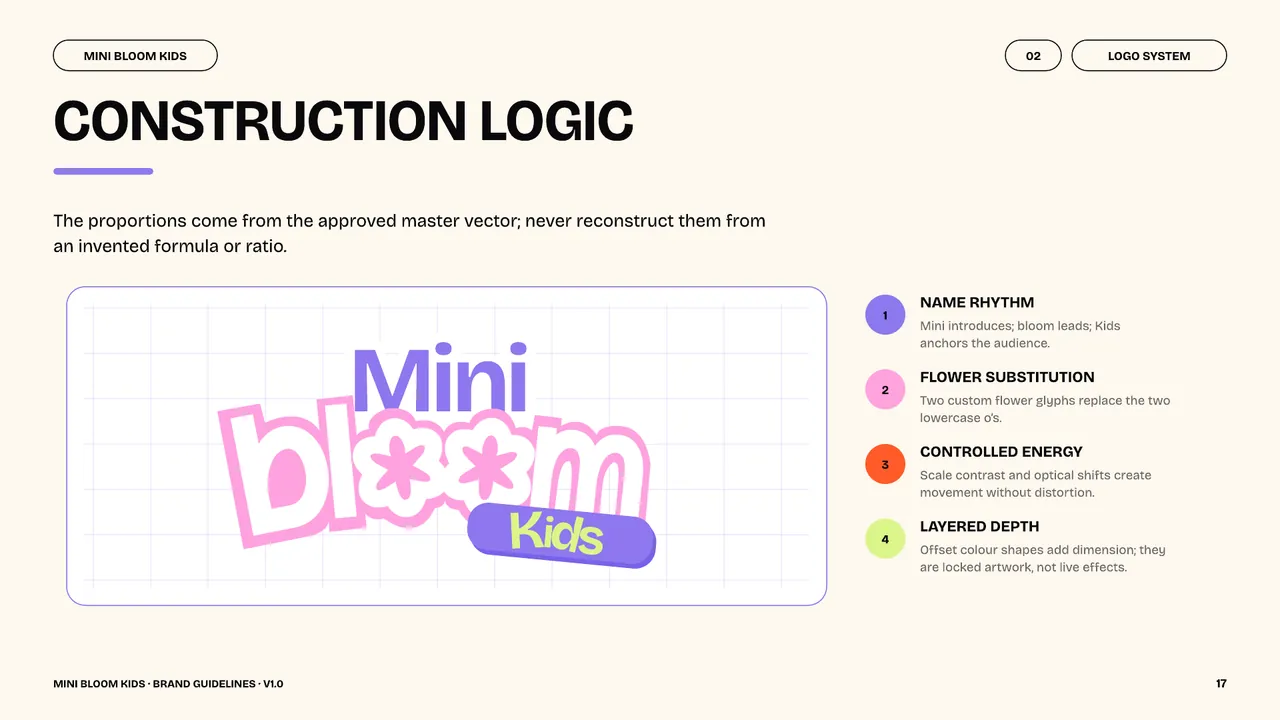
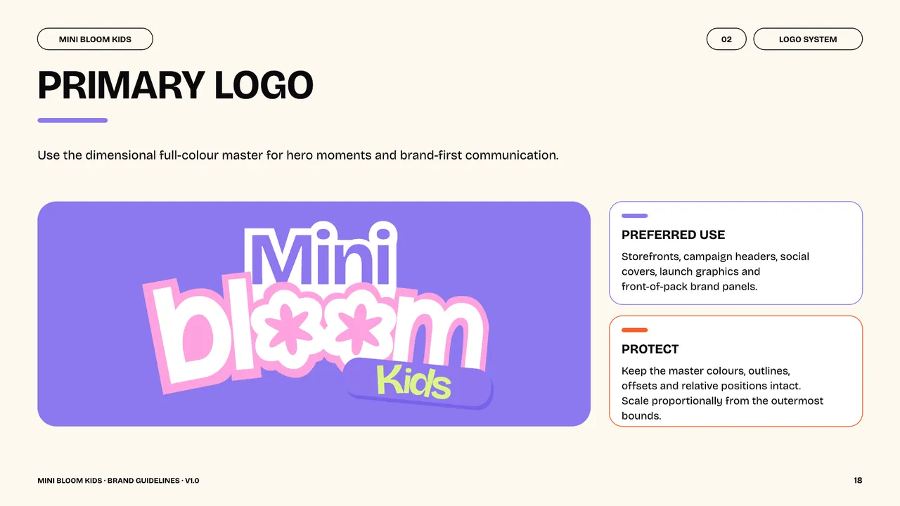
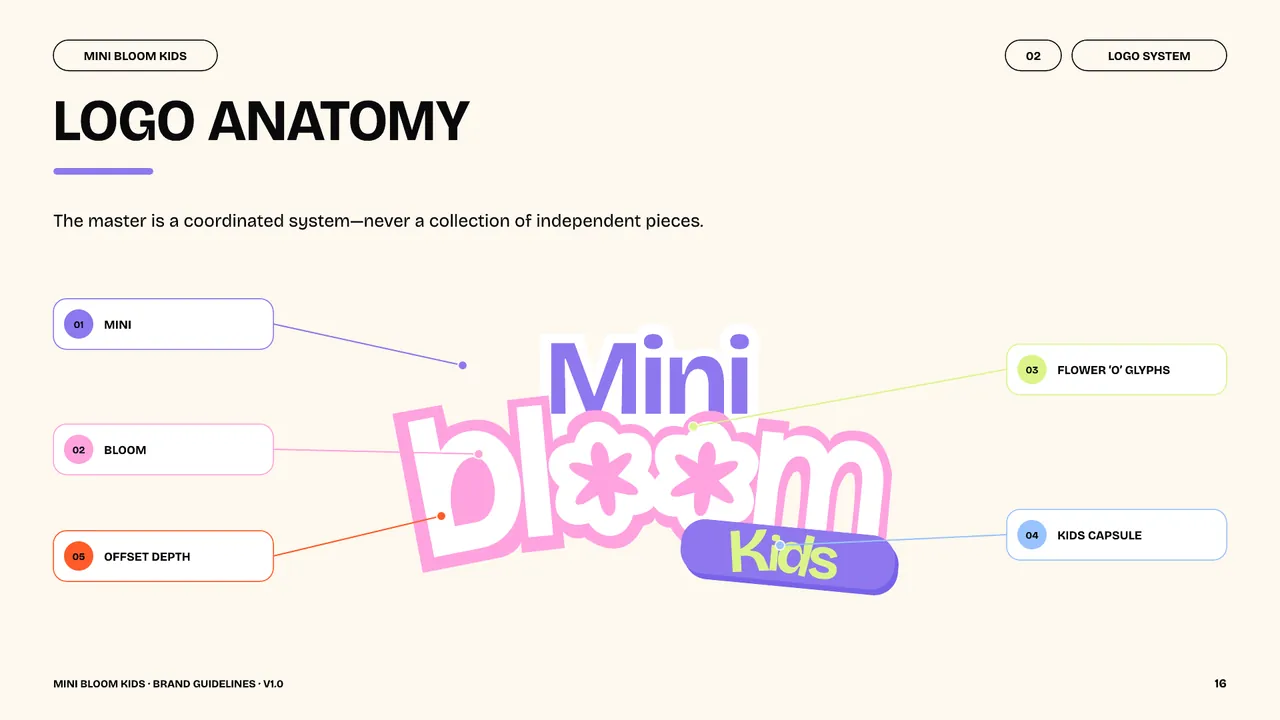
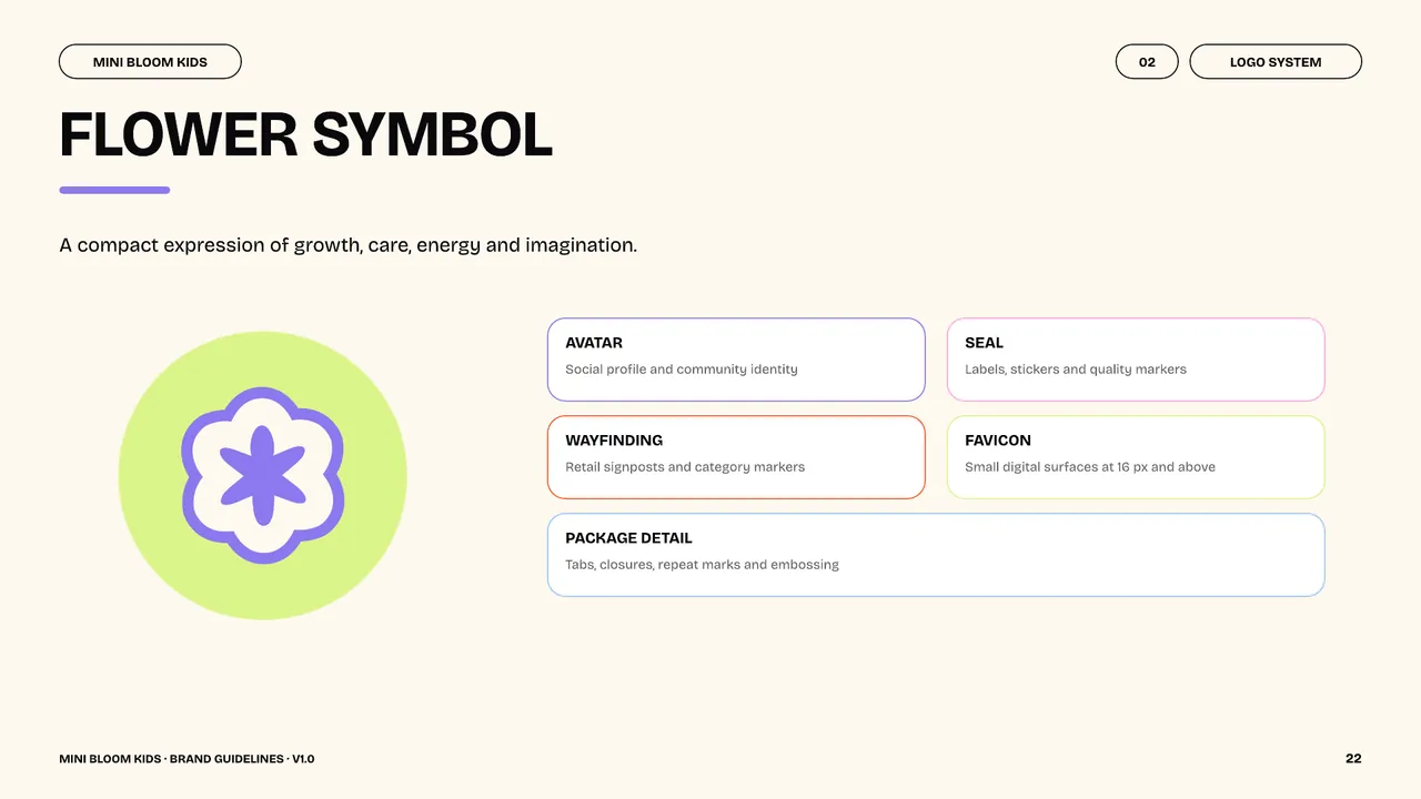
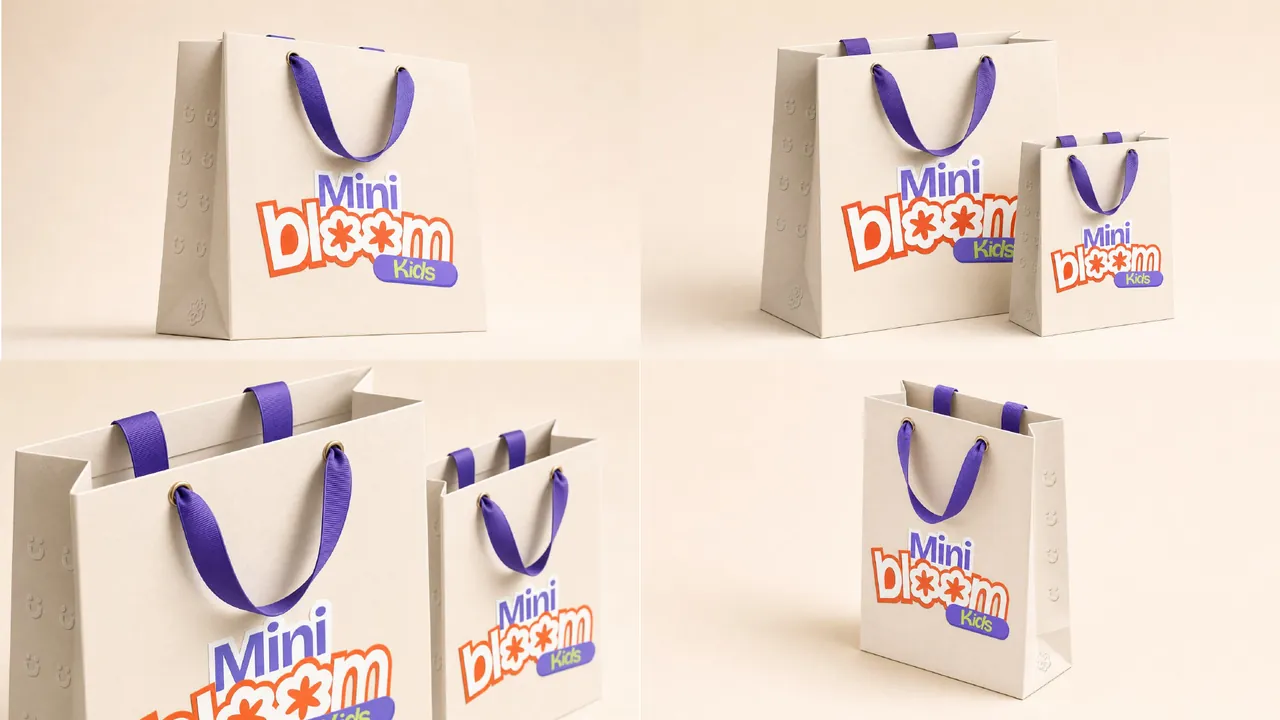
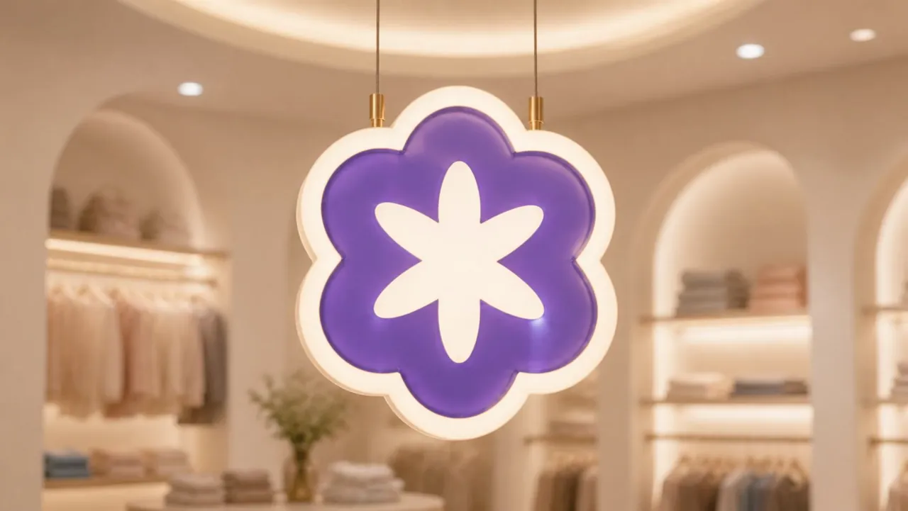
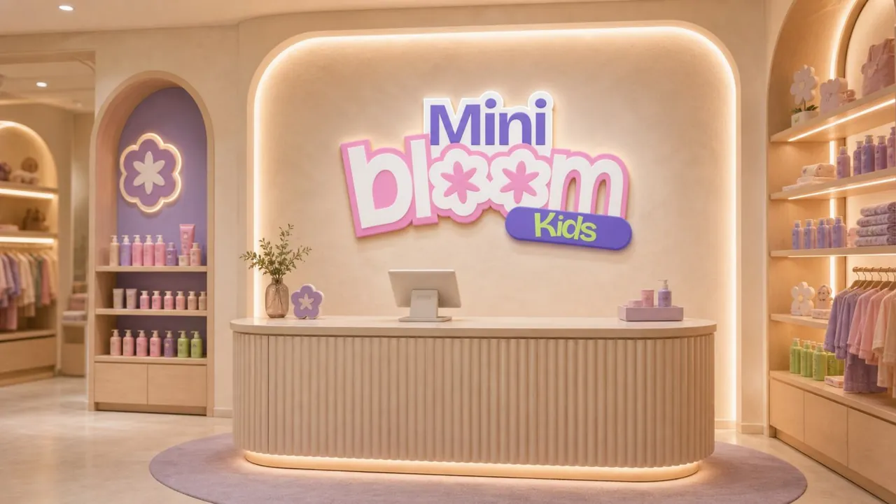
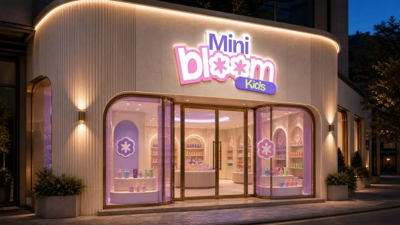
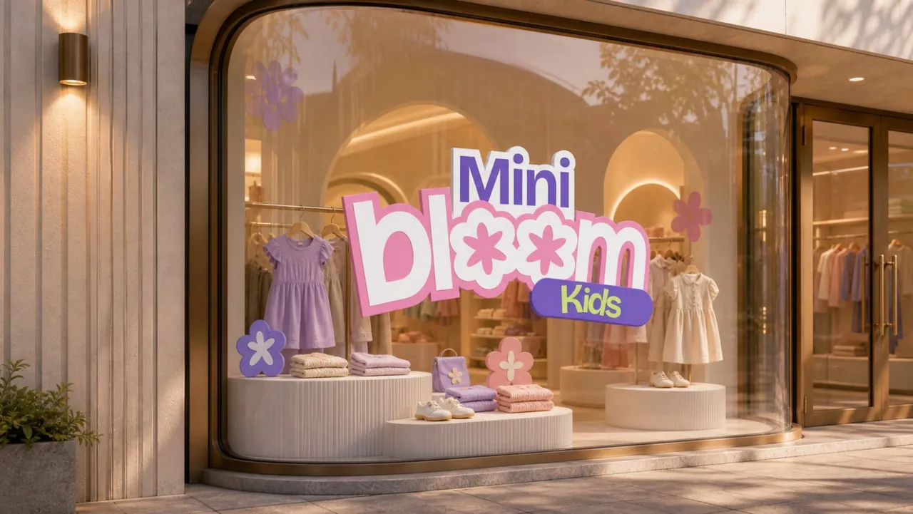
Mini Bloom Kids brings growth, care and confident play into a colourful visual identity. Flower forms replace the two o letters in the wordmark, while layered outlines and a tilted Kids capsule give the logo movement and depth.
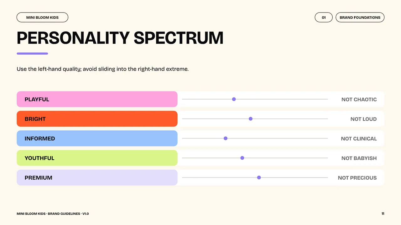
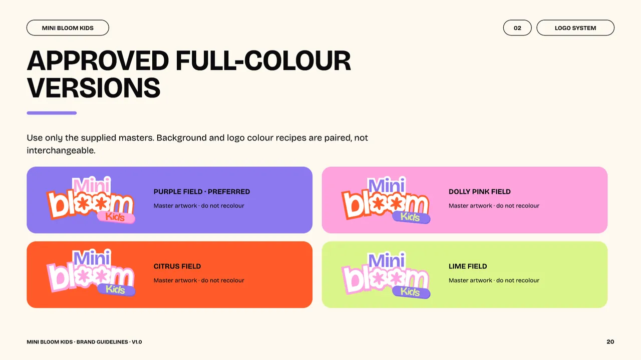
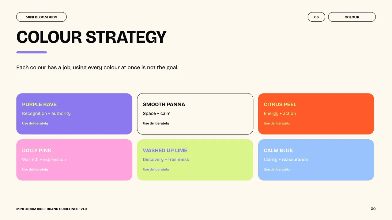
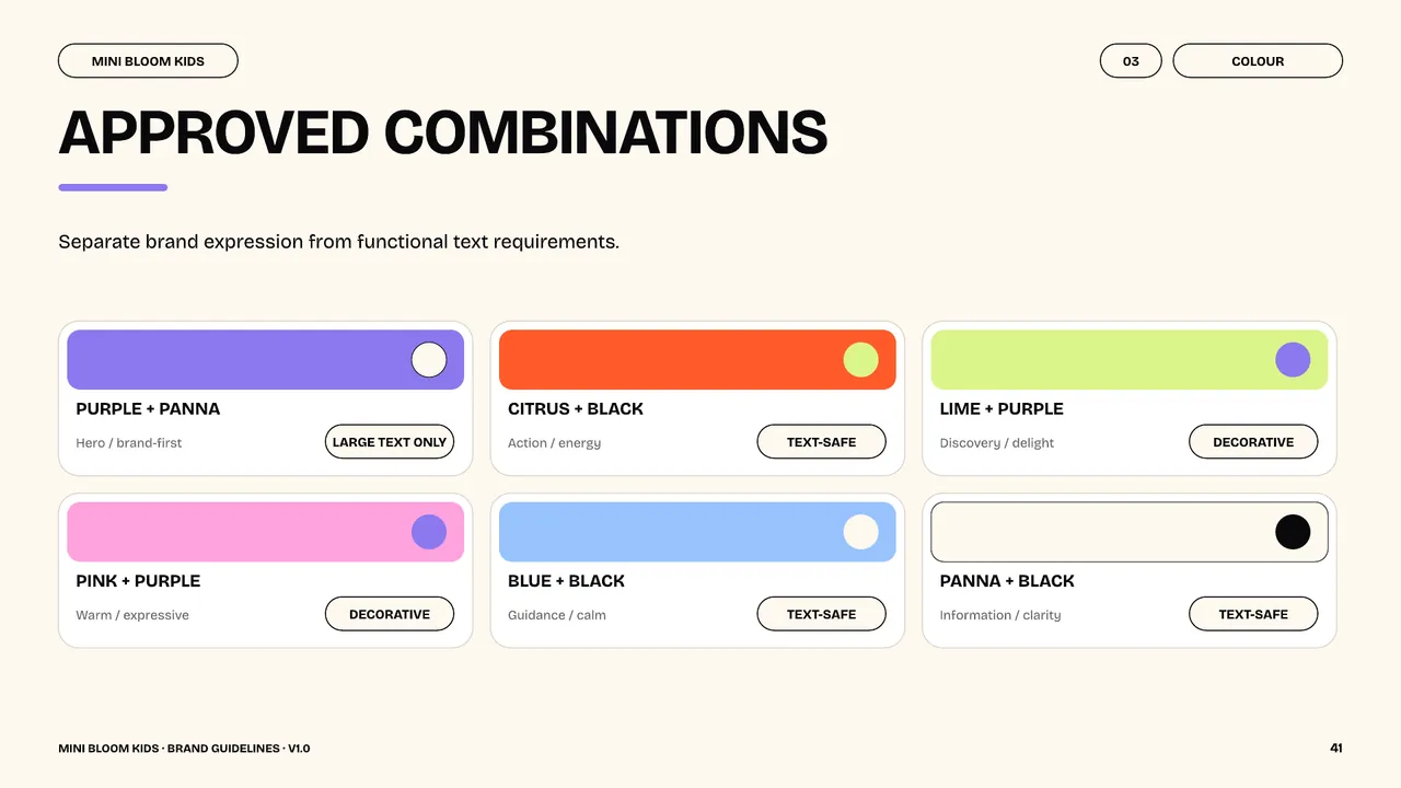
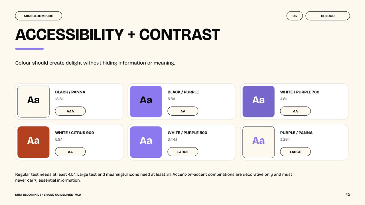
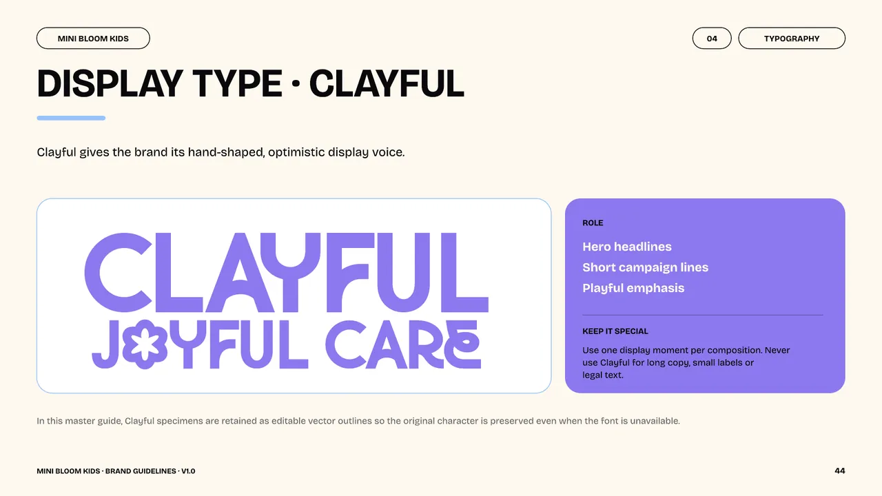
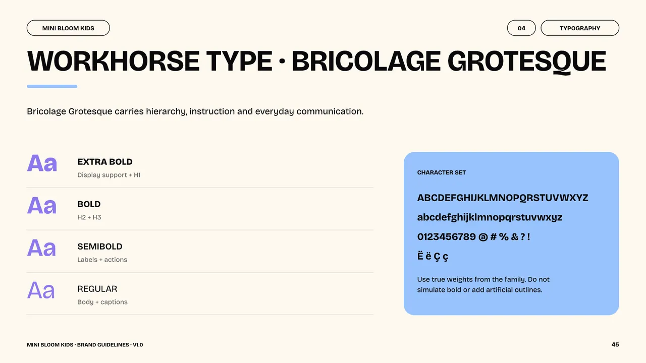
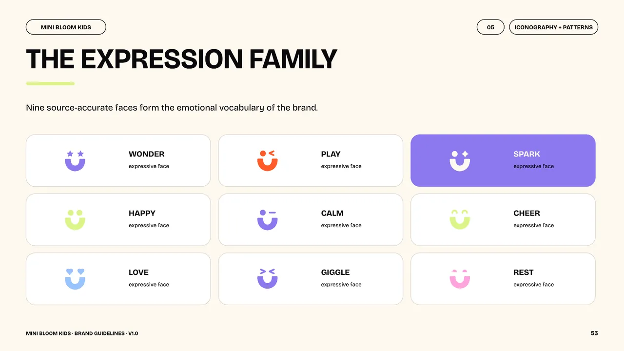
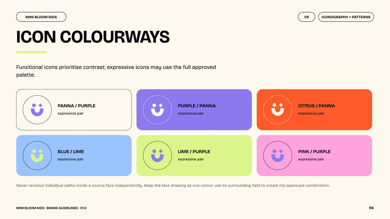
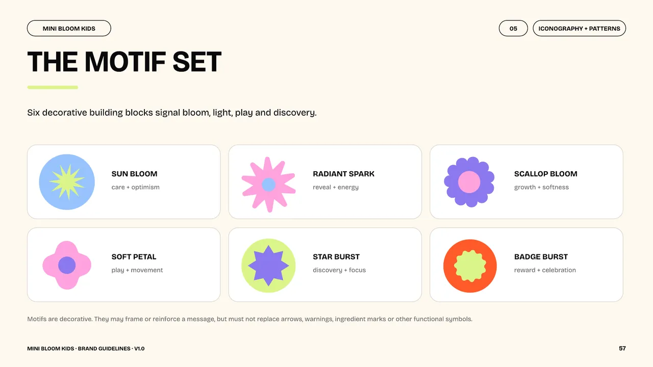
The August 2026 guidelines bring together the logo system, a palette of purple, citrus, pink, lime and calm blue, Clayful display type and Bricolage Grotesque supporting type. Expressive icons and floral motifs extend the system across the packaging and signage mockups shown here.
Credits
Studio
PHORM x MORPH
Brand IdentityBrand Guidelines
EXPLORE MORE WORK
View all work-

Tidal Trails
An exhibition concept for Lake Shkodra connecting communities, local motifs and wildlife awareness.
Exhibition DesignBrand Identity -

Core Art Foundation
A distinctive wordmark and flexible visual system for print, signage and digital communications.
Brand IdentityArts & Culture -
POKET
Social media content combining bold campaign graphics, product imagery and a playful tone of voice.
Social Media