
Ortho
An architectural identity shaped by proportion, restraint and the quiet character of a space.
About the Project
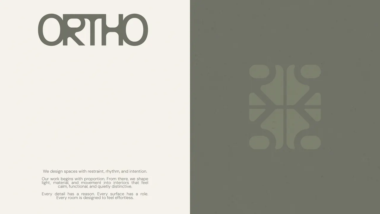
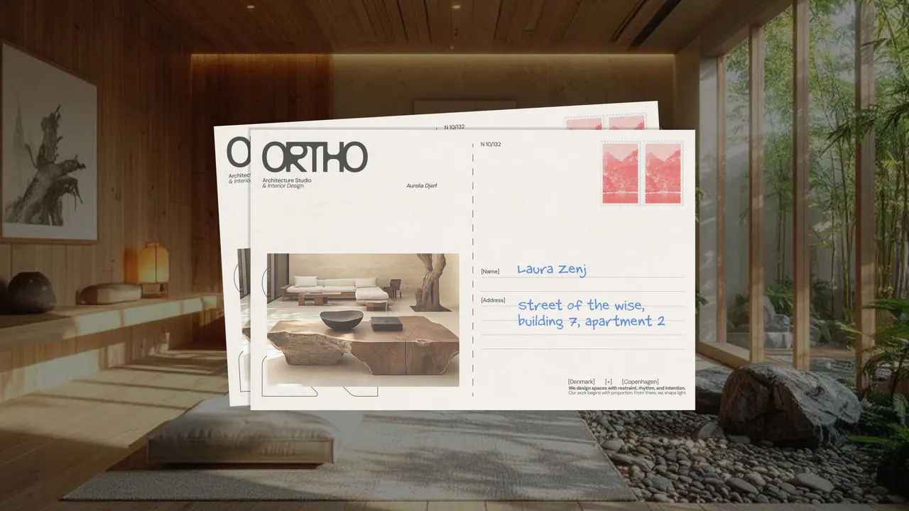
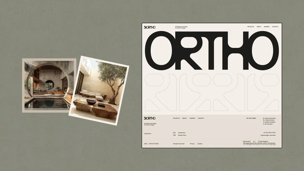
Ortho is an architecture and interior design studio with a focus on calm, intentional spaces. The visual identity translates that approach into a system of balanced forms, tactile materials and considered typography.
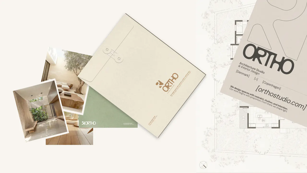
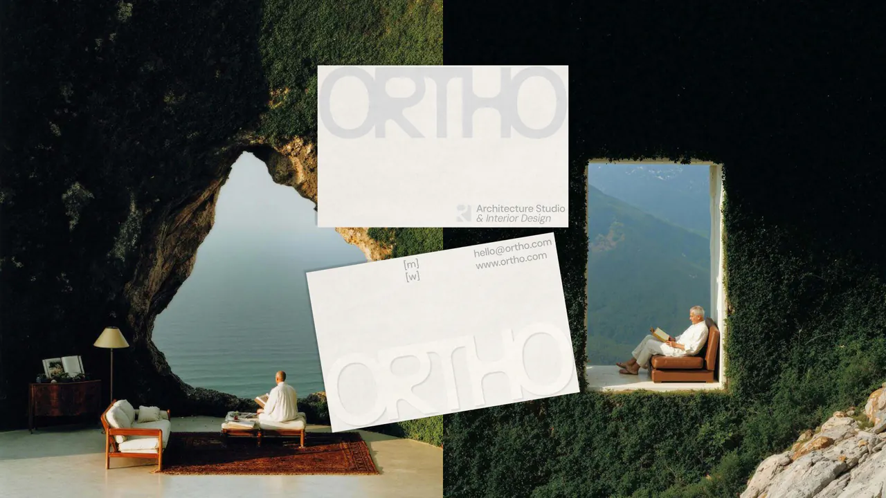
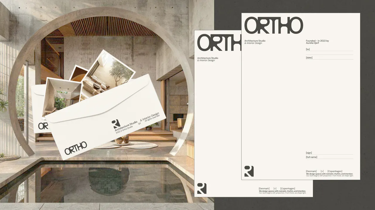
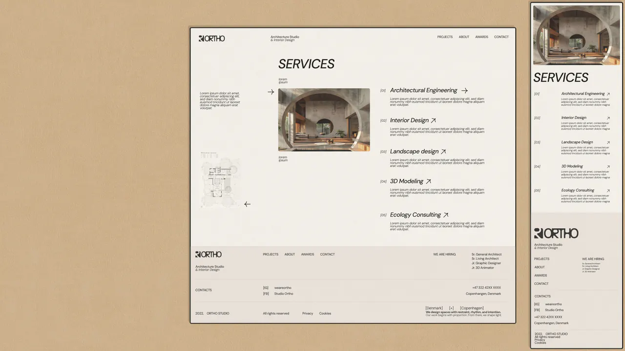
A distinctive wordmark and modular symbol sit alongside a palette of olive, ivory and warm neutrals. Across business cards, stationery, printed matter and website layouts, the system gives architecture room to speak.
Credits
Creative direction & design
PHORM x MORPH
Brand identity
Print & digital design
EXPLORE MORE WORK
View all work-

Rubrum Roma
A wine bar identity with an expressive script wordmark, a crimson palette and photographic posters.
Food & DrinkBrand Identity -
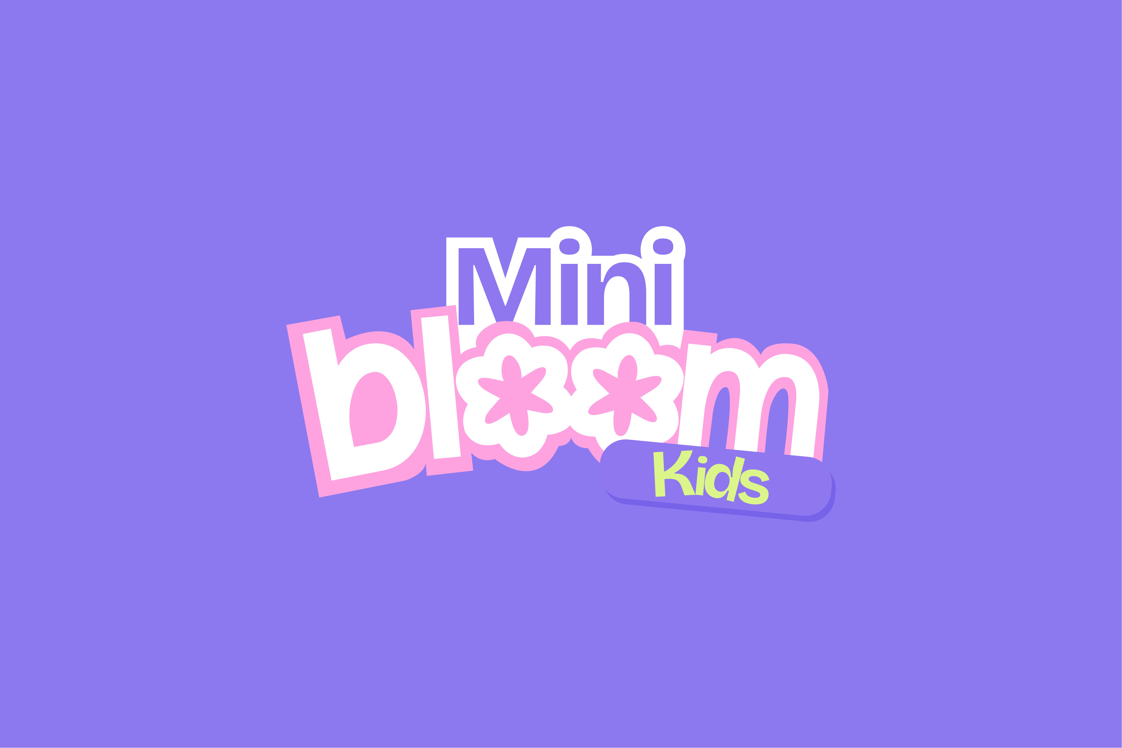
Mini Bloom Kids
A playful visual identity with flower-inspired lettering and expressive brand guidelines.
Brand IdentityBrand Guidelines -

Tidal Trails
An exhibition concept for Lake Shkodra connecting communities, local motifs and wildlife awareness.
Exhibition DesignBrand Identity